Identifying Corrector 1 of ULF
For the last few posts in my series on Greek handwriting and manuscripts I’ve been looking at a manuscript I’m calling ULF, short for uncatalogued lectionary fragment. Two correctors have been identified, and in this post we’re going to try to figure out if one of them came first and if the first one was the original scribe.
Who Is #1?
We have two scribes who are easily distinguished based on the color of their ink. That has turned out to be very helpful. So who was the first corrector, brown-ink-corrector (whom I will call Bric) or black-ink-corrector (whom I will call Blic)? Fortunately, we have enough evidence to make that determination. I have two pieces of evidence so far. Maybe more will surface by the time we’re finished with the manuscript.
The first bit of evidence is this snippet:

Note the word that looks scraped off between line 1 and line 2. You can see the ink of Blic at the end of line 1 and at the beginning of line two. Also note the ligature of Blic at the end of line 1 that looks like a less-than-sign. Here is the same ligature in Hierosolymitanus (ελπιζομεν):

That’s not a ligature I’ve seen the original scribe of ULF use. So, back to the correction. It looks like Blic attempted to erase Bric’s work. So, unless Blic can break the law of cause-and-effect, that means Bric preceded Blic. So, in proper corrector parlance, Bric is corrector 1, and Blic is corrector 2.
Is Bric The Original Scribe?
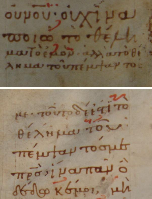
So if Blic is corrector two, it is most unlikely that the is the scribe of ULF. However, Bric’s corrections could have been made by the original scribe as he went back over his work. The inks look the same, so we need to check handwriting. Fortunately, the scribe of ULF omitted a large chunk of text that Bric filled in, so we have something to work with. Here’s the snippet:

First of all, we know that the last two lines of the first snippet are a correction because they drop below the normal stopping point for every other page of the manuscript and the text is noticeably smaller than the normal text (This correction, BTW, is the second reason why Blic came after Bric. Blic is good about correcting even itacisms. I think he would have noticed an omission this big and made a note).
The second part of the snippet is included so you can see some words for reference, and it comes from the top of the very next leaf (it looks like the pic for the next leaf was taken in very different light). Some of the words in the correction occur in the text on the next leaf, so these are great for comparing handwriting, which we will do now.
Notice the phrase θελημα του πεμψαντος in both. The first word in both are almost exact likenesses. The upsilon in in the second word for the non-corrected text looks wider than the article in the corrector’s text, but they still look very similar. Even the accent looks the same.
It’s the third word, πεμψαντος, that strikes me as the most interesting. The spacing between the epsilon and the mu is the same for both, the connection between the mu and psi is the same for both, and both have a pretty large gap between the tau and the omicron/sigma ending.
The only significant difference I see between the two is the way the tau is formed three characters into Bric’s snippet. That’s unusually big for this manuscript (so far).
Conclusion
So is Bric the work of the original scribe? At this point I am leaning strongly towards "yes" based on handwriting, but don’t quote me on that yet.
Comments
Brett 2008-05-19 07:30:23
Two questions:
1. You wrote:
Is that Bric's or Blic's snippet? I read this kind of quickly.
2. I wonder if the tau is written that way to indicate that it is not part of θεληματ (which is the root of θελημα) since there is no space following θελημα. The "capital" tau would then indicate a new word.
I don't know how to insert or use Greek font. Is it hard? What Greek font do you use on this site?
Eric 2008-05-20 09:24:30
1. That would be Bric's since it is in brown ink and not black.
2. Yes, I think that is why it is written as large as it is. On the bottom part of the snippet he didn't do that though. Why? Probably because he had room for a space as you say, so you're probably correct.
I type in unicode but set the font in the site styling to use Gentium. Do you have that font installed? As for entry, I use the standard Windows unicode keyboard. It's kindof slow to learn, but when you get used to it the layout works fine. Of course you're Mac guy if I remember right...so good luck :)