Using the Viewport Meta Tag for Fun and Profit
Yesterday I posted what is
basically my intro to this series on mobile web development. For a bit we are going to talk
about some things that affect mobile web development whether you are focusing on just making some
content work on mobile or if you are building a mobile web app. The first thing to talk about is
the viewport meta tag. To show what this does, we’re going to iterate through
making a page mobile-friendly. First, the page without modifications:
<!DOCTYPE html>
<html>
<head>
  <title>Viewport Test Page</title>
  <style type="text/css">
    body
    {
      background-color: #CCC;
      margin: 0;
      padding: 0;
    }
    #content
    {
      background-color: #FFF;
      padding: 10px;
      width: 940px;
    }
  </style>
</head>
<body>
  <div id="content">
    <h1>Page Header</h1>

    <p>Lorizzle ipsum dolor i'm in the shizzle amizzle...</p>

    <p>Sizzle vitae bizzle in arcu go to hizzle consequat...</p>
  </div>
</body>
</html>
As far as Html goes, simple stuff. You have a header and two paragraphs (clipped here because actually showing all the gangster lorum ipsum does you no good) wrapped in a div. The width of the content is constrained to 960px (940px width plus 20px padding), but that’s it. Here is how it looks on my iPhone.

Okay, so that’s mostly unreadable. Prepare for much pinching and zooming! Most links I click on in Twitter end up on pages that look like this, which is not awesome. The problem is that the content of the page has been scaled to fit within the viewport of the device.
Wut you ask? Well, the viewport on a device like the iPhone is the part you can view. If viewing the device in a vertical orientation, you have 320px of width and 480px of height (double that for retina screens though all that I am about to show you works equally well on both resolutions). Most pages I visit via the Twitters look like this because I have a viewport of 320px but the size of the site is set to something much larger, like 960px. Fortunately, using the viewport meta tag can help things. Observe the following tag:
<meta name="viewport" content="width=device-width">
If I add that to the head tag of my page, upload it and view it on my iPhone,
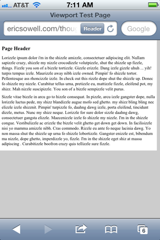
I get this:

It is better, but not quite ready yet. It is at this point more readable but you still have to
some scrolling back and forth. Not cool. So let’s change one thing in our Css. Fixed-width
dimensions on web pages make things much more difficult for making something work well for
mobile, so let’s change the width to max-width. We get the
following:

Well golly, that’s much more readable. Surely in more primitive cultures I would be called a magician for such wonderous feats.
There is more you can do with this meta tag. Let’s try setting the initial scale of the page. If we were to set this to 1, we would see what we saw before. Boring! Let’s take this up to 11!
<meta name="viewport" content="width=device-width, initial-scale=11">

Bam! In yo face! I have no idea why you would want to do that but at least you now know that
you can. You can also specify a value for maximum-scale. Another option is to
remove scaling by putting user-scalable=no. And as you might guess, this is
often a bad idea because you run the risk of hurting usability.
So there is the viewport meta tag. But there is still a problem. What if things
don’t look quite right at this smaller size? It would be nice if there was an easy way
of styling the page differently depending on the page width. Fortunately there is a way to
do this using Css media queries, which we will discuss next time.